The Brand
Valley Pike Farm Market
Located in Weyers Cave, VA, Valley Pike Farm Market sells an array of local products including jams, sauces, beers and wines, skincare, and more. The business also operates a coffee shop and sandwich bar with locally sourced meats and cheeses and produce. Valley Pike Farm Market strives to create a welcoming environment that embraces the agricultural history of the community.
The Message
As part of an Elements of Creative Advertising course, I and a team of four students produced four social media ads with the objective of increasing sales of the Market's products during the summer months of May to September 2025. The platforms used for the advertisements include Instagram, Facebook, Pinterest, and TikTok. The central theme of each post revolves around summertime gift giving with the Market's products. Below are the posts for Instagram and Facebook, of which I contributed to the design, photography, and created the final mockups.
Creative Brief


Instagram Posts

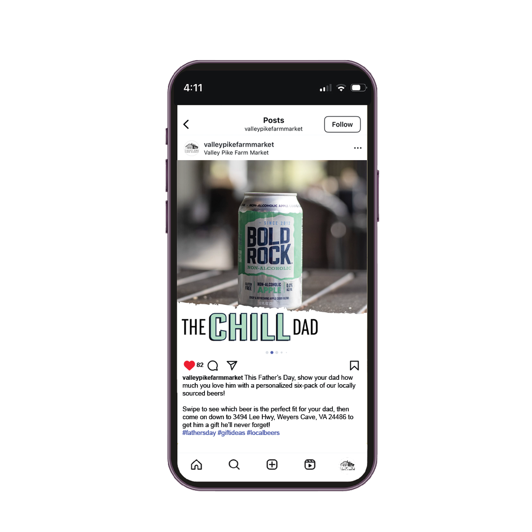
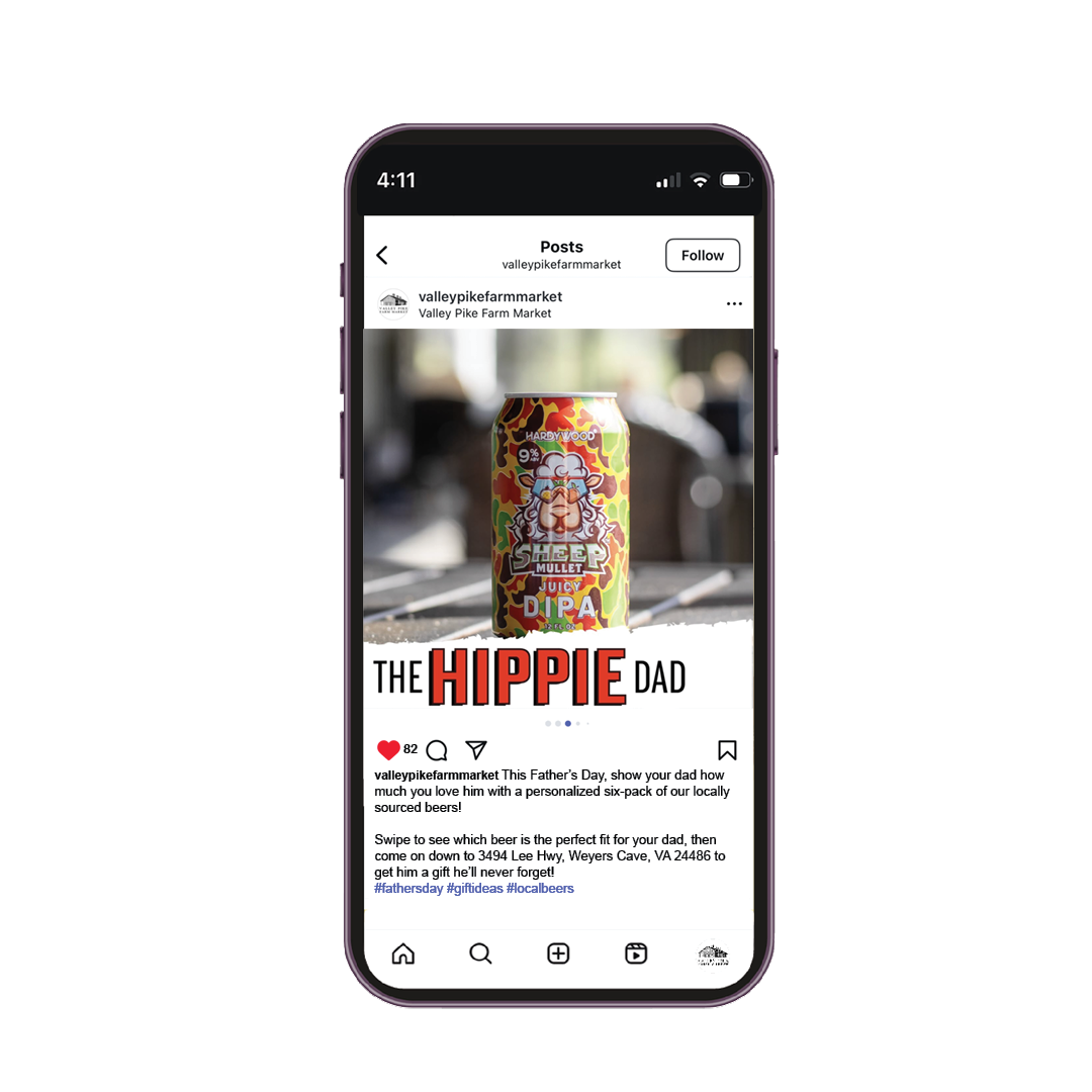


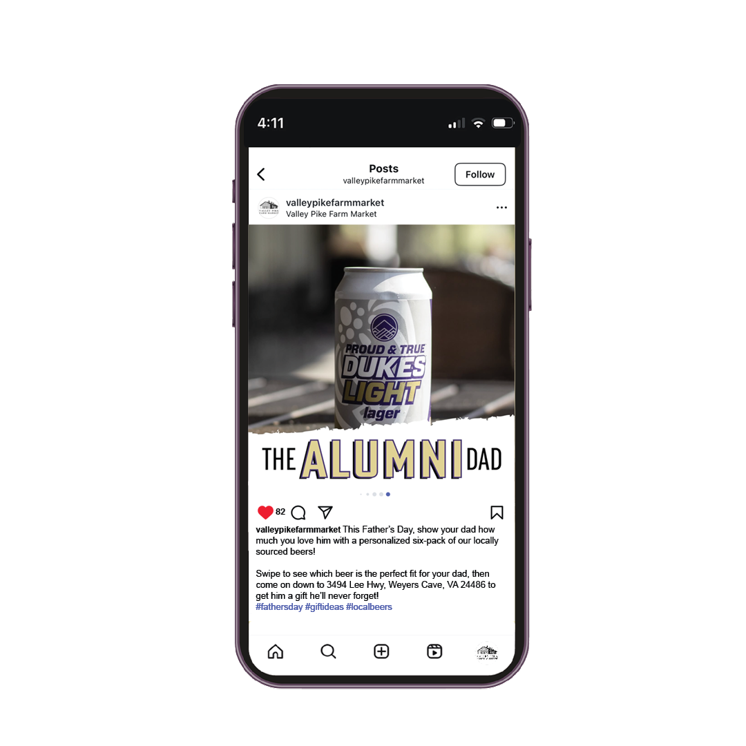


Creative Approach - Father's Day Six-Pack
The Father’s Day six-pack post uses fun wordplay and personality to engage the viewer. It is not just about the beer, it is also about the kind of dad who would drink it. The fonts are bold and all-caps, which are built to feel strong and masculine, reminding the target of their father. The torn-edge background adds a rugged, manly texture, while each slide color-matches the text to the beer label, tying everything together visually. Each slide zooms in on a specific can and matches it with a “dad type”. This instantly makes the viewer identify the beer with their dad’s personality. This makes the product feel more like a custom gift. The copy is fun and easy to relate to as well. “Raise a can for your old man” is catchy and grabs the viewer’s attention right away. Each dad type is named in a funny, friendly way to help people quickly find one that fits their own dad. This post works because it is personal and easy to connect with—everyone knows a dad like one of these. The big, bold cans grab attention, the fun labels make it easy to shop by personality, and the short, catchy text makes it memorable.
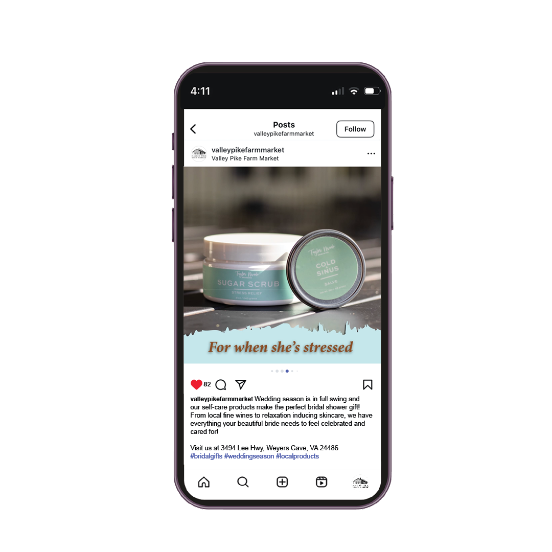
Creative Approach - Bridal Basket
The soft sky-blue background creates a calm, peaceful feeling, while the warm golden-brown font color adds a touch of rustic charm to the bridal basket post. The headline and captions use a fanciful serif font that feels classy and romantic, like something that would be seen on a wedding invitation. The italics add a personal touch to the font, as if it were hand-written as well. Each slide has text on some part of the page with a torn-edge look, making it feel like part of a story. The lines all start with “For when she…” to show how each item helps the bride with a specific moment or feeling. Each image focuses on a single product or group, giving each item its “moment.” This clear visual hierarchy helps the viewer imagine not just what is in the basket, but why it is in the basket. The first image shows the full basket, and each slide after shows what is inside, one step at a time. Lastly, the captions are kind and thoughtful. Each “For when she…” line relates to what the bride might be feeling, like stress or needing a break. This shows that these items are not just gifts, but solutions.
Facebook Posts
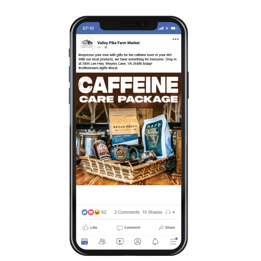

Creative Approach - Caffeinated Care Package
The first Facebook post features a multitude of Valley Pike Farm Market’s locally sourced coffee products in a caffeinated care package. The image showcases the different products in a way that is visually pleasing and stimulating to the eye. The headline “CAFFEINE CARE PACKAGE” in a thick, slab font creates a visual hierarchy and catches the viewer’s eye while scrolling on the platform. The choice to have a rustic, wooden background for this advertisement highlights the Market’s atmosphere to viewers. The colors of the products enhance the rustic background colors, and the pops of blue make the image stand out. The caption begins with a pun to catch the viewer’s attention and clearly states the main message of gift-giving to the audience.
Creative Approach - Barbeque Essentials
The second Facebook post highlights several local products that are commonly used for barbeques. The image features products such as Shawnee barbeque sauces, Three Notch’d Brewing Company beer, and Route 11 potato chips as gifts for a summertime host for Independence Day. The differing levels of the products in the image creates visual interest and leads the eye through the different products shown. The alcoholic beverages in the image also place the focus and message on Independence Day celebrations through the patriotic colors of red, white, and blue. The headline “Grilling season is here!” imposed on the image in bold, thick white text catches the viewer’s attention while leading the viewer to the caption for more information about the products shown. The hook in the caption of “Don’t show up to the barbeque empty-handed!” employs a command-style approach in catching the viewer’s attention. The caption clearly identifies products with the messaging of gifts for summertime hosts.